Redesigning the Motorway homepage to increase the enquiry rate and lower the cost per enquiry
Lead Product Designer | Web | 2023
Overview
The Motorway homepage hadn't been revisited since Koto's rebrand in 2019. The Marketing consultancy Simon Kutcher had conducted quantitive research with over 1,000 people and uncovered 5 key areas that are most important to our users, Price, Ease, Speed, Trust and Free.
The upper funnel is of course the oldest part on the site, and therefore has a lot of legacy code within. This meant that not only was the redesign quite emotional for the Co-founders and therefore would involve a lot of opinions, but as it's older there was not much data and insights we could use to identify user needs.
Goal: Increase enquiries to 6.5m in Q3 through SEO improvements, and therefore lowering the CPE to £5.22.
Role
Lead Product Designer
Workshop facilitation, Stakeholder management, Rapid prototyping, User research, Visual design, SEO improvements.
Teammembers
1 x Product Manager, 3 x Frontend Engineers, 1 x Content Designer, 2 x Backend Engineers, 1 x Agile Delivery Manager
Timescale
May - September 2023
The challenge
We've identified two main areas for improvement: SEO and the five key areas that consulting firm Simon Kucher highlighted. These include:
Price - We currently explain that sellers can achieve the highest returns on our platform, but our messaging could be clearer. Our research shows that 84% of people are more satisfied with the price they received from Motorway compared to our competitors.
Free - Emphasizing the cost-free nature of our service is crucial, as it's a key concern for our customers.
Ease - We need to better communicate the simplicity of our process. Our explanations are currently too far down the page. According to our user testing with Hotjar, people aren't scrolling far enough to see them.
Speed - We mention speed throughout our process, but don't emphasize it enough in the upper funnel. We should highlight features like instant valuation, photo-taking in 4 minutes, same-day car sales, and instant transfers.
Trust - While we display Trustpilot ratings, incorporating more social proof can help build trust with our users.
In terms of SEO, we've recognised a significant opportunity for improvement. We'll focus on refining the hierarchy of information displayed, improving page speed, and most importantly, enhancing internal linking with the main search term of ‘sell my car’.
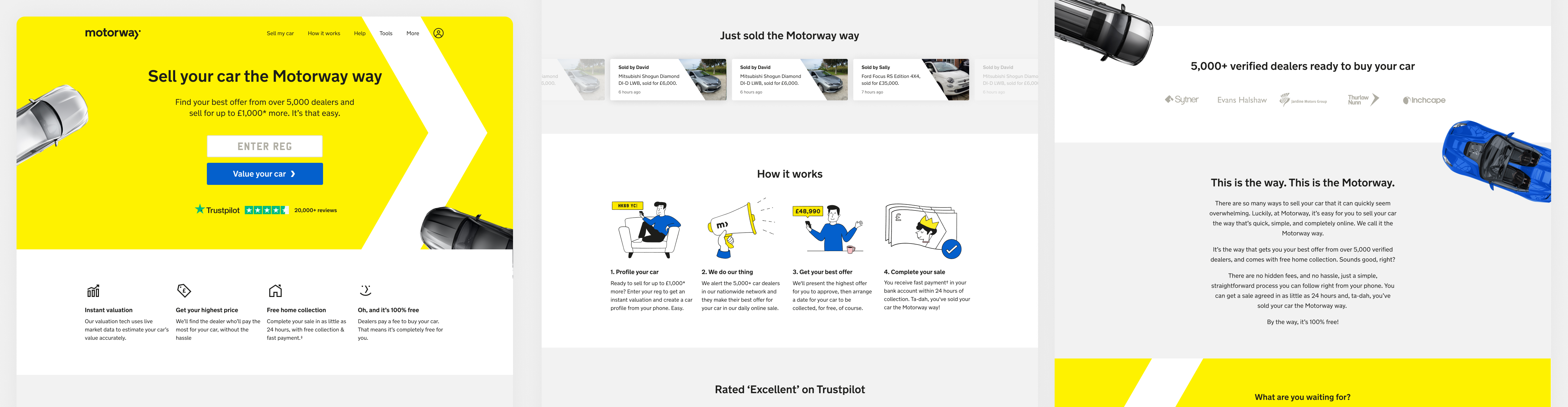
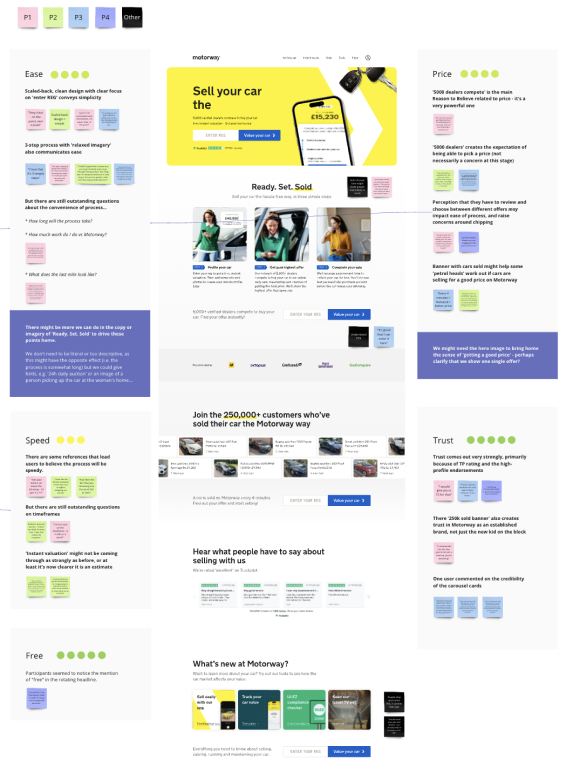
What the homepage used to look like. The strategy here was to improve SEO, hence where there is so much content within the page. Clearly it was in desperate need for a lot of love.
The Solution
In the process of redesigning the Motorway homepage, we initiated a series of strategic actions to ensure optimum results.
Firstly, I conducted a workshop that brought together key members of our team - the brand design team, the Product Manager, and the Content Designer. This collaborative initiative was aimed at dissecting and understanding the research we had gathered so far. We critically assessed how our existing website was addressing the key themes that had emerged from our research and brainstormed on potential strategies we could adopt to address these themes more effectively.
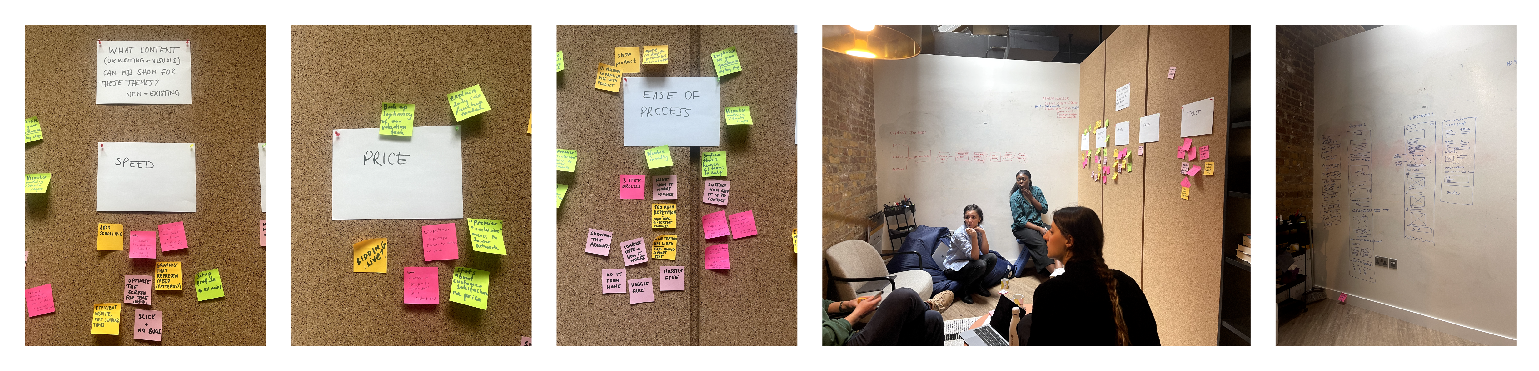
A small selection of photos taken from a part of the workshop. It was a fun day! I encouraged everyone to sketch out their ideas for the homepage, so we had a variety of options to discuss and move forward with.
To maintain momentum and ensure rapid progress, we adopted the strategy of working in design sprintsworking quickly and testing after each week. At the end of each sprint, we reviewed our progress and provided detailed feedback to the design team as well as all stakeholders involved in the project. This consistent communication loop ensured that all stakeholders were kept abreast with the progression of the project and were able to provide necessary input in a timely manner.
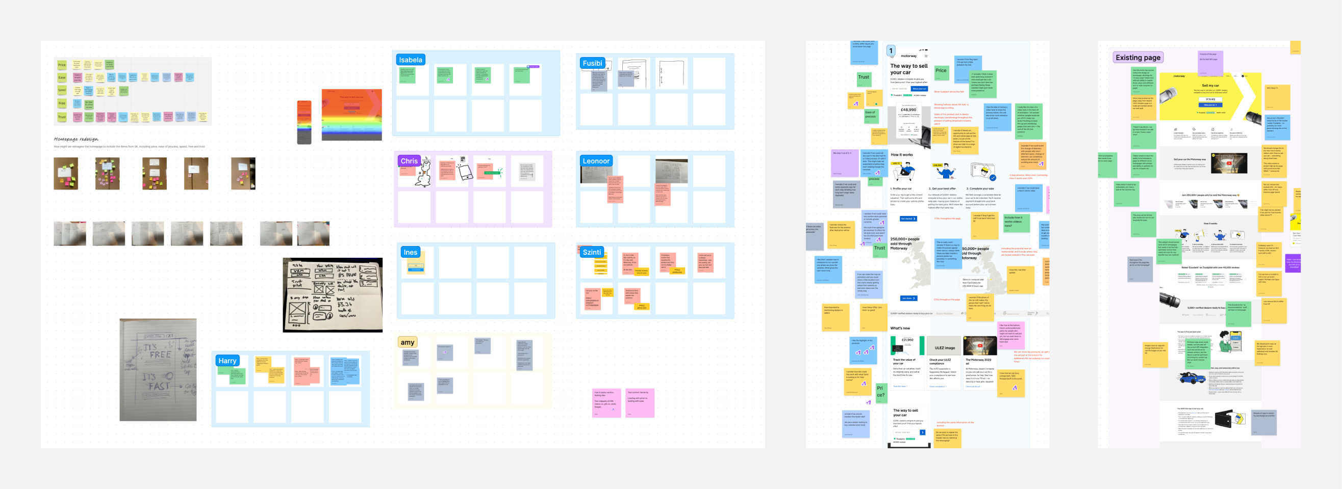
A selection of Figjam files used to conduct workshops with stakeholders as well as the design team.
User Research
Understanding the perspective of our users was critical to the success of the redesign. To this end, we conducted a series of user interviews. The primary objective of these interviews was to gauge user perception of each section of the webpage. We paid special attention to whether users mentioned the five key areas we had set out to capture. This feedback was then utilised to refine our design and ensure it resonated with user expectations and requirements.
We fed back to stakeholders the results we were receiving little and often, to ensure their confidence in the progress we were making.
A significant part of the redesign process was working alongside one of our brand designers to collaborate on the visual design of the site. This was a vital step, as it ensured that the new design aligned with the overall brand aesthetic while also addressing the insights gathered from user interviews and research.
Finally, we continuously iterated on our hypothesis, testing it with users gradually to gain a deep understanding of their perceptions. This iterative process was invaluable in refining our design and strategies and ensuring that the redesigned homepage met both user needs and business objectives.
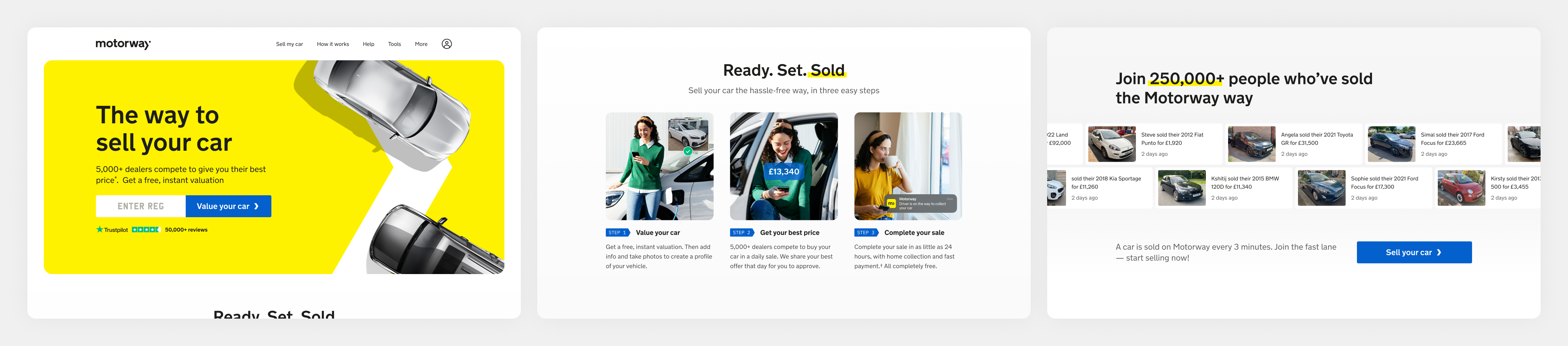
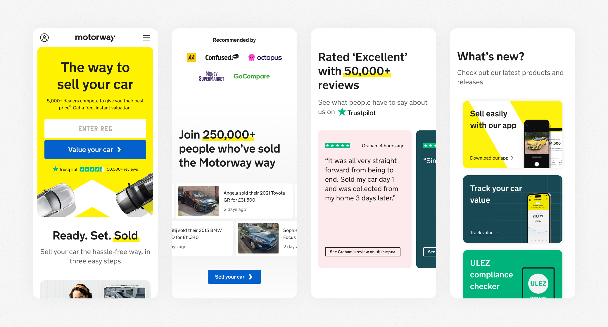
The final UI. We simplified the steps to sell, creating visual treatments that will pass down through the funnel unifying the brand and product. Including CTAs as we scroll down, ensuring the type hierarchy is correct, and the page includes internal linking where possible.
A/B testing
During the build we were able to set up the homepage ensuring that we could gather as much data as possible, to know what worked and what didn't. We were able to understand that our users scrolled further than they were previously, which in turn assisted to the uplift in SK research improvement areas.
The hero section is the part of the site we felt could be improved upon further, to increase the enquiry rate further. Using the tool Cameleeon, we were able to schedule A/B tests to test our many hypothesise, adjusting the percentage of viewers, old site vs new.
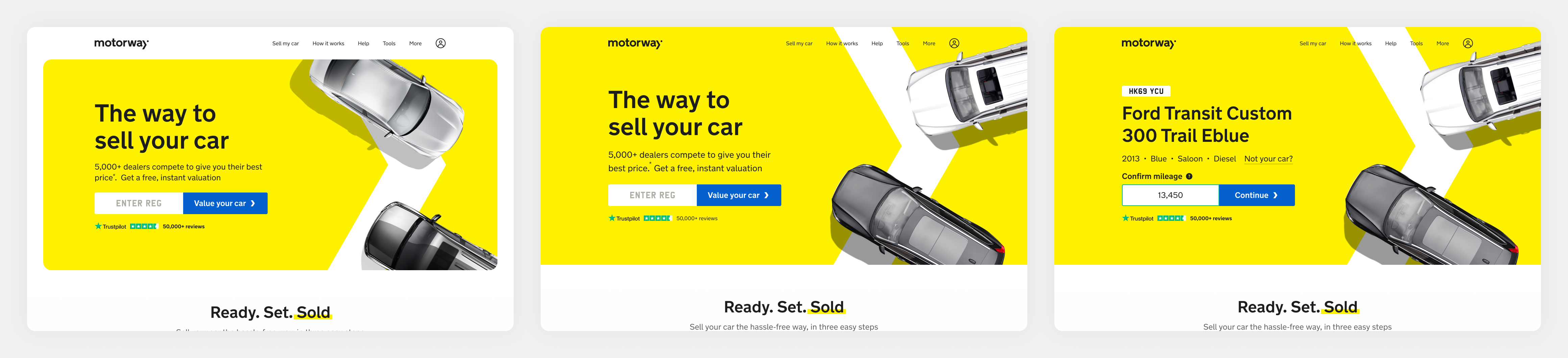
The original homepage against the second hero that we tested. The hypothesis being the full bleed hero puts less focus on the navbar and therefore less distracting.
Results & metrics
This was a very different kind of project for me, heavily visual, all senior stakeholders included, a very opinionated project. I have learnt an incredible amount after working on this piece, and that has only benefitted the company to know we now have solid data to continue improving the upper funnel.
7%
Offer select increase, proving that increased information assisted in reassuring the users.
35%
Average SEO visibility improvement, across all devices
This is definitely not the end, the homepage will be a big focus point for the team, continuously testing and iterating on hypothesies.
The biggest lesson I’ve learnt? There’s no point continuously tweaking visuals when you have no idea how they will perform, even if the request to change it has come from stakeholders, we must ensure that everyone is on the same page and people feel comfortable with the decisions to make bold changes, especially when something has a lot of emotion involved.